Wisebaron

Toronto Fintech Robo-Advisor | Design and Product Management

Project

Information

The client

Wisebaron is a Toronto-based Fintech startup that operates in the Robo-advisor industry among Wealthsimple, CI Investment, RBC, and Wealthfront. This online app bridges human interaction and DIY capabilities to craft tailored ETF portfolio solutions for mid-career individuals and households. This market is typically 28–42-year-old homeowners with available investment funds starting at $150K.

The goal

After a handful of detailed meetings, several digital media needs are identified. Firstly, Wisebaron requires a detailed digital strategy that entails a sophisticated website, web app, branding, animations, and digital marketing.

Results

After discussing our strategy, we proceeded with the initial website design, I drafted up all the designs on Adobe XD and had periodic meetings throughout the entire design process, where I communicate all the design choices and the client provides his input and I work on the revisions. This back and forth process provides freedom and flexibility that no template can offer, and truly able to create a website that 100% fit your brand and vision. After the first draft is completed, we went over several versions and revisions, making the client 100% satisfied with the design before moving on to the development stage.

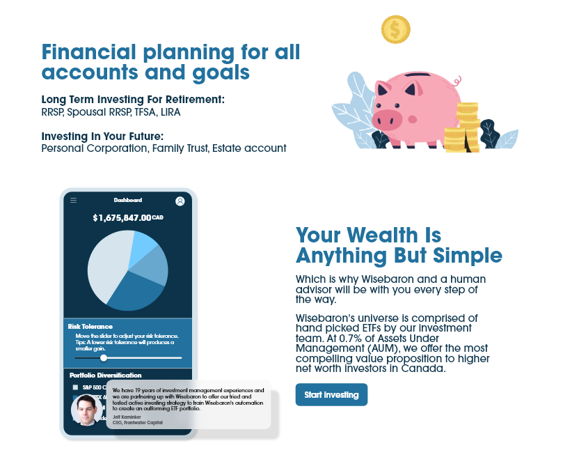
Custom graphics and Lottie animations

I will create or find illustrations, animations, mockups, or graphic designs that fit into your website and branding for each client. The piggy bank is a Lottie animation that will embed seamlessly into the WordPress websites we make. The phone UI graphic is made completely in-house which we also worked on for a concept design for Wisebaron’s mobile app.

Engaging Designs and UI/UX Best Practices

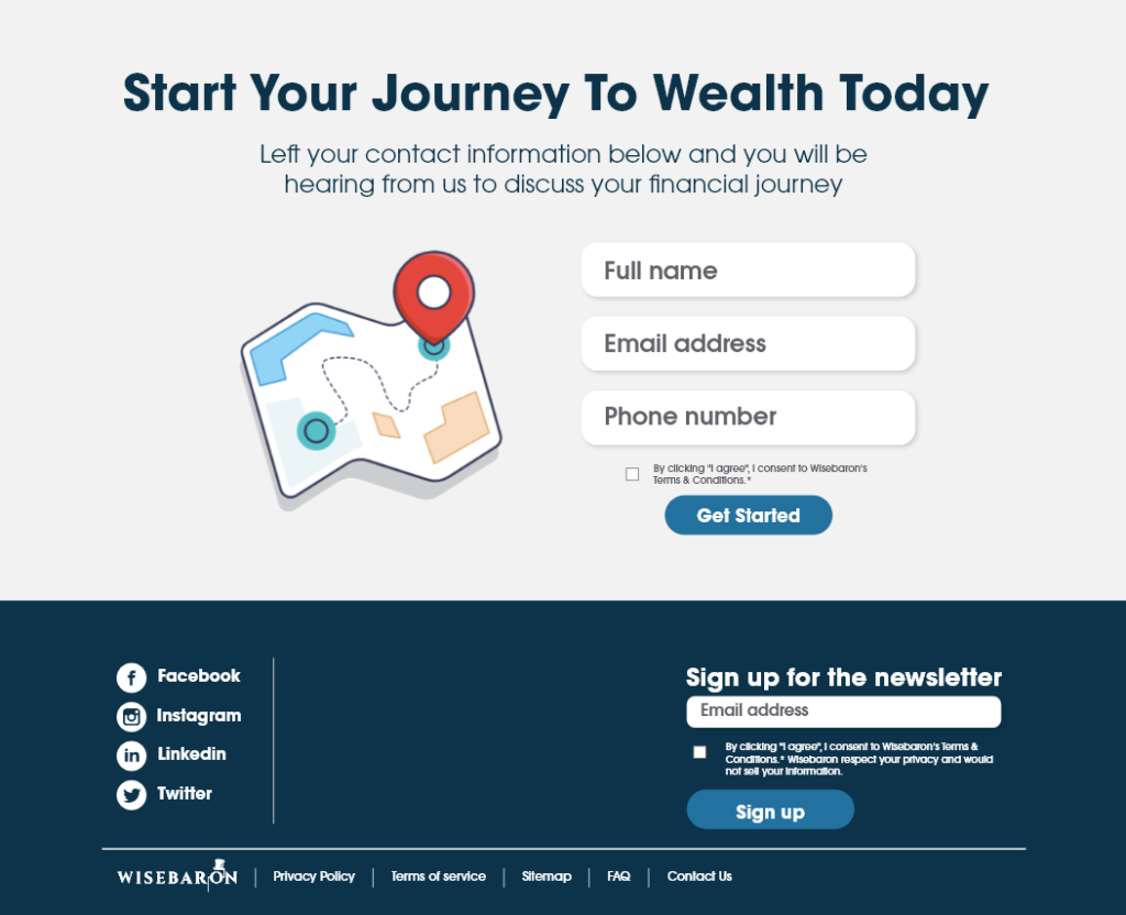
To tie the whole financial journey theme together. we decided to use an animation from Lottiefiles illustrating a map marker moving through a map from point A to point B. We created a simple contact form for users to easily contact the investment experts at Wisebaron. With the footer, we included social media icons that link to the company’ssocial media accounts and an email newsletter signup on the right. We have also included the terms of service, privacy policy, and site map links on the bottom as web design best practices.